
Home Blogs Technical The Imperative of Mobile Responsiveness in Web Design
Posted By: Shriji Solutions
18 November, 2023
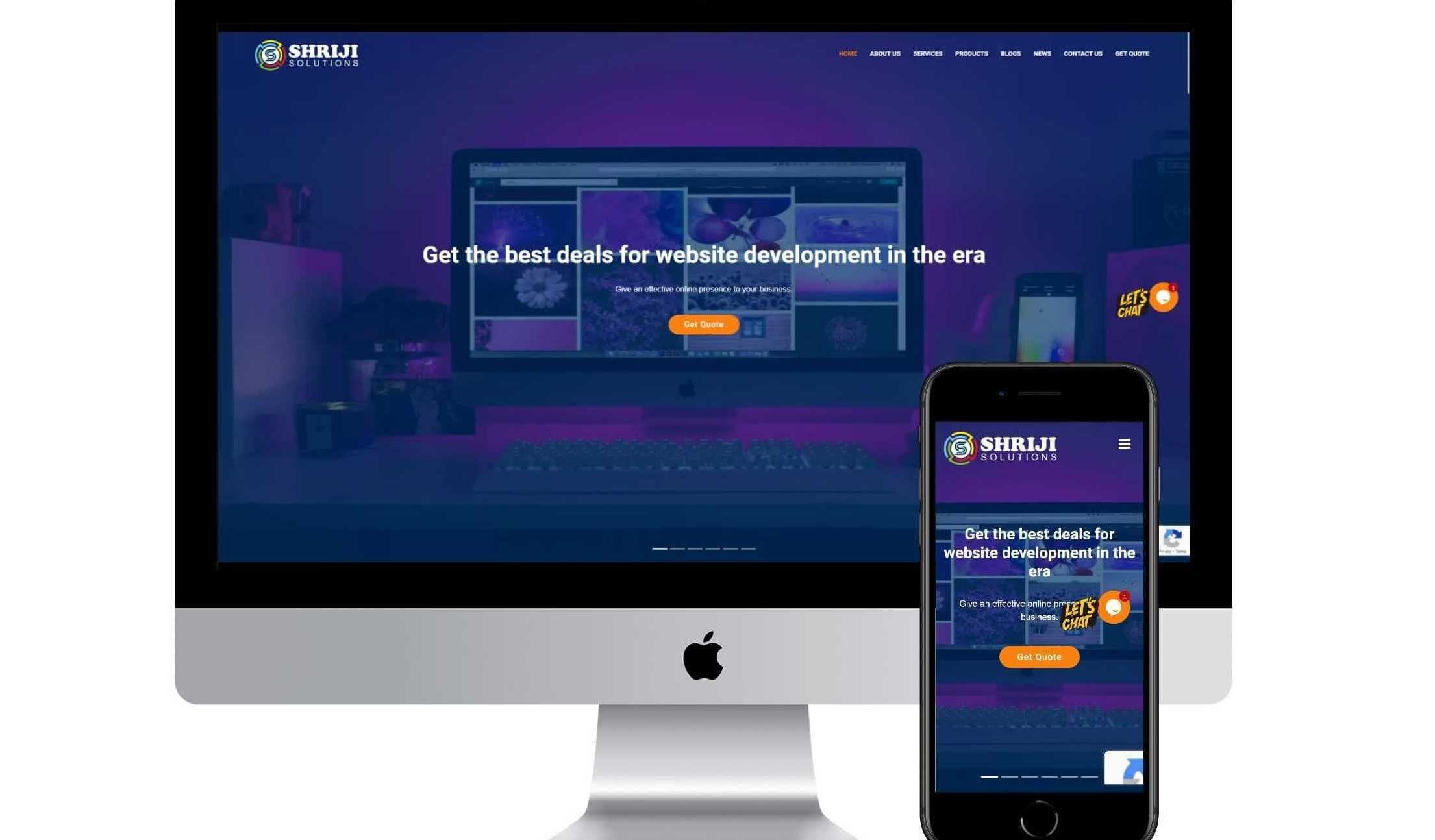
In the ever-evolving landscape of the digital age, a strong online presence cannot be compromised for businesses and individuals. A website acts as a virtual storefront, serving as the first point of contact for potential customers or visitors. In this context, the importance of mobile responsiveness cannot be underestimated.
Since most internet users now access websites via mobile devices, ensuring that your site is optimized for a seamless mobile experience is not just a trend but a necessity. In this blog post, we will discuss the reasons why mobile responsiveness is important for the success of any website.
1. Dominance of Mobile Use
The advent of smart phones has revolutionized the way people access information. According to recent statistics, a large percentage of Internet users access websites through mobile devices. This trend is not limited to any specific demographic; rather, it spans age groups, occupations, and geographic locations. Ignoring mobile audiences means missing out on a huge pool of potential visitors and customers. Mobile responsiveness ensures that your website is accessible and visually appealing on a variety of devices, allowing you to take advantage of this broad user base.
2. User Experience Matters
User experience (UX) is a key factor in determining the success or failure of a website. When users encounter a site that is not optimized for mobile viewing, they may face a number of problems such as distorted images, unreadable text, and cumbersome navigation. This result in a frustrating experience, drives away visitors, and potentially damages your brand's reputation. On the other hand, a mobile-responsive design guarantees a consistent and user-friendly experience across all devices, promoting positive interactions and encouraging users to stay on your site longer.
3. Search Engine Optimization (SEO) Benefits
Search engines like Google give priority to mobile-friendly websites in their rankings. Google, in particular, uses mobile-first indexing; meaning it primarily uses the mobile version of a site for indexing and ranking. A mobile-responsive design signals to search engines that your website is committed to providing a quality user experience, which in turn improves your chances of ranking higher in search results. Improved search engine visibility leads to increased organic traffic, which is a fundamental goal for any website aiming to reach a wide audience.
4. Adaptability to Different Devices
The landscape of digital devices is diverse, ranging from smart phones and tablets to laptops and desktop computers. A website that is mobile-responsive is designed to seamlessly adapt to the different screen sizes and resolutions of these devices. This adaptability ensures that your content is presented in an optimal manner, whether viewed on a small Smartphone screen or a large desktop monitor. By catering to your audience's preferences, you increase your website's accessibility and usability, contributing to a positive overall user experience.
5. Decrease in Bounce Rate
Bounce occurs when a visitor leaves a website after viewing only one page. High bounce rates are often associated with poor user experience, and lack of mobile responsiveness is a common cause. When users find a site that is not optimized for their mobile device, they tend to abandon it in search of a more user-friendly alternative. A mobile-responsive design reduces bounce rates by providing a consistent and engaging experience, encouraging users to explore multiple pages and interact with your content.
6. Faster Page Load Times
Mobile users, often on the go, value speed and efficiency. Mobile-responsive design is naturally optimized for faster page load times on mobile devices. Slow loading pages frustrate users and can lead to abandonment. By prioritizing mobile responsiveness, you ensure that your website loads fast, capturing and maintaining users' attention in an age where attention spans are increasingly limited.
7. Cost-efficiency in Development and Maintenance
Maintaining separate websites for desktop and mobile versions can be resource-intensive and expensive. A mobile-responsive design streamlines the development and maintenance process by creating a single, flexible website that caters to all devices. This approach not only saves time and money but also eliminates the need for duplicate content management and updates. As the digital landscape is evolving, having a cost-effective and efficient solution for web development is a strategic advantage.
8. Enhanced Credibility and Professionalism
In the digital sphere, first impressions matter. A website that is not optimized for mobile devices may appear outdated and unprofessional. In contrast, a mobile-responsive design shows that your business or personal brand is visionary and committed to providing a modern and inclusive online experience. Building credibility and trust with your audience is an important step in establishing a lasting online presence.
9. Adapt to Industry Trends
The field of web design is dynamic, with trends and technologies evolving rapidly. Mobile responsiveness isn't just a checkbox on a list of best practices; it is a reflection of a website's ability to adapt to the current technological landscape. By prioritizing mobile responsiveness, you position your website to seamlessly integrate with emerging technologies and design trends, ensuring its relevance and effectiveness in the long run.
10. Global Reach and Accessibility
The Internet has made the world a global marketplace, and reaching diverse audiences is now more possible than ever. Mobile devices have become the primary means of Internet access in many parts of the world, especially in areas where traditional desktop computers may be less prevalent. A mobile-responsive website transcends geographical boundaries, making your content accessible to users regardless of their location or the device they use.
Conclusion
Mobile responsiveness is not just a feature; this is a strategic imperative for any website that wants to thrive in the digital landscape. From enhancing user experience and search engine visibility to driving adoption across diverse devices and reducing bounce rates, the benefits are manifold. As the digital sphere continues to evolve, investing in mobile responsiveness is an investment in the future success and sustainability of your online presence. So, whether you're building a new website or revamping an existing one, make mobile responsiveness a top priority – your users and your bottom line will thank you. Get a free quote to build a mobile responsive website.
